
On Friday, October 17, I will be present during Gallery Night MKE at Nō Studios to talk about my photography on display. I’ll also have a vending space with a variety of prints and greeting cards.
Part of my joy with photography is exploring paper and seeing how paper and ink can alter the look and impact of an image. I’ve been printing with the same company for ten years. My favorite papers with them is silk and metallic. All my smaller prints are automatically printed on silk paper. Images with sunrises, jewel tones, gray leaning towards silver are printed on metallic paper.
Nō Studios is a wonderful brick-wall high-ceiling open space. Robert Knapp,
Events and Hospitality Manager, asked for big pieces for his big walls for Gallery Night. Quite honestly, I was a bit intimidated by the ask. I’ve done gallery shows in New York City for my various communities – work, art, neighborhood, etc. New York was my starting and training ground. Most of the print asks for shows in the City were 10×13 and 11×14. Mostly, I stick to these sizes. They travel, shipsl and store well. I’ve also edited my images to these sizes.
Ergo my initial intimidation. I shared with Rob my editing and print history. And told him, if I can enlarge some and get them printed in time, I will.
Unfortunately, there’s an occasional wannabe perfectionist in me. I spent far too much time, about two weeks, trying to re-edit and re-size images for larger prints. As I increased the size of my prints, I lost the option to print on silk and metallic paper. Luster and giclée became my only options with my preferred printer.

After the mild texture of silk and the vibrant color pop on the silk and metallic, luster doesn’t do much for me. That is until I spread the prints on a table. I know what I’m drawn to, but the way I’m able to capture color still awes me. My 360MKE selections on luster paper are beautiful.
Since 2023, I’ve been printing some of my Juneteenth Series on giclée paper. I’ve sampled low, medium and heavy textures. I like it. However, the Juneteenth Series is a bit somber, so I didn’t jump for joy with results.
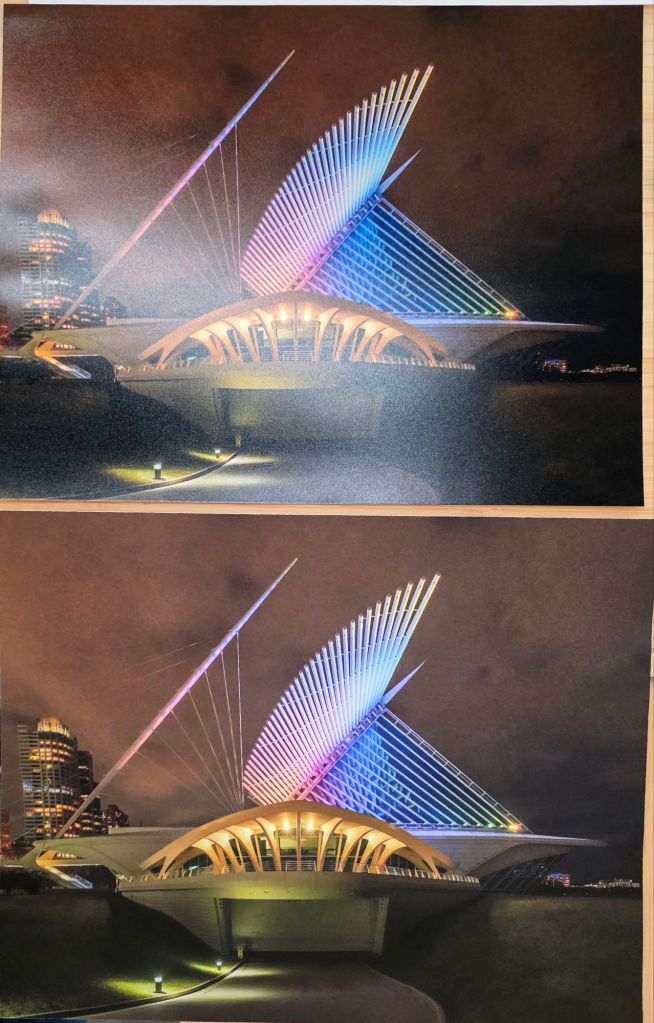
Two images in this gallery show are printed on giclée paper. Same subject and angle. One image is at night the other is with a bright beautiful blue sky. My mouth fell open when I saw these on the giclée paper. The night image was also printed on luster so I could see a side by side comparison. They both look great, but the giclée has the look of a timeless heirloom art piece.
I’m not a fan of sheen unless its adding something to the image. That’s perhaps why I love the silk paper. The slight texture dulls the shine.
Giclée is an absolute matte. No sheen. Pure color. Now, I have a new favorite paper.
This is more than I thought I had to say about my photo paper options. Having seen what I’ve seen with the printing for this gallery show, giclée will most likely be my go-to paper for large prints going forward.
Images are from my 360MKE Perspective Study featuring
– Milwaukee Art Museum
– Shipwreck on Lake Michigan
– Spillover II by Jaume Pensa
Stop by. Take a look. Gift yourself. Gift others.
Images from my Juneteenth Series will also be on display.
Nō Studios
1037 W. McKinley Ave
Oct 17-18, 5:30-9:30pm
https://gallerynightmke.com/participants/around-town/no-studios/
Next: How frames impact pricing.

Leave a comment